Visualizing Science
Visual thinking has power to inform the scientific process.
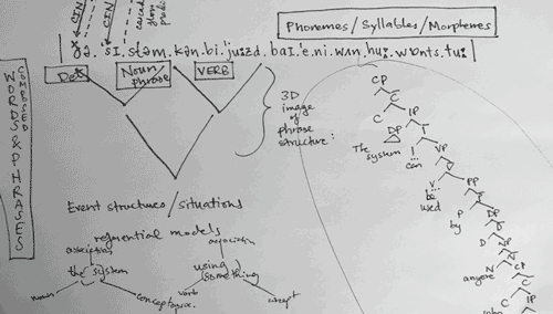
Andrea Martin, an experimental psychologist at the University of Edinburgh, studies what she refers to as “the most powerful communication system in the known universe” — human language. She reached out to me for help with creating a clear visual depiction of the model she had developed for how we speak and understand language.
We began a visual exploration that started with a draft of her paper, her rough sketch, and many questions from me. I sent draft illustrations; she responded with feedback. I replied with more questions and additional drafts. We had clarifying conversations over Skype and e-mail, and finally arrived at a visual representation that felt right.
You can see a video version of this sequence on YouTube
This is not an unusual design process. What I found fascinating was how the act of making her model visual had a direct influence on the thinking behind it. At one point along the way, Andrea commented: “the design process is really making me think more deeply about my model.” As we finished up, she thanked me for catalyzing her ideas and pushing her thinking to be more specific and clear.
More than communication
I’ve realized that there is something inherent in the process of illustrating a theoretical concept that requires a different way of thinking. When you have to make a visible mark to represent a particular component, it forces you to make decisions about how that piece relates to others and to the whole. You have to think more precisely about hierarchies, sequence, causation, and more. It moves an abstract thought into the realm of the concrete — from fuzzy to well defined. As a result, the process can quickly expose gaps in thinking, or suggest new avenues for exploration and understanding.
I’ve seen similar discoveries occur when researchers see data visualized in a new way. A client commented to me recently: “I learned more about this data in the last five minutes than in weeks of looking at it.”
We are visual creatures - I suppose it shouldn’t be surprising that we understand things differently when we see them. Scientists have been visualizing their research for centuries, but the visual exploration of abstract theories, systems, or processes may be an unfamiliar path for many researchers.
A few suggestions…
Start visualization early
Incorporate visual thinking early in your process, even if it’s just rough sketches on paper. Unexpected and meaningful results can come when a researcher collaborates with an experienced information designer, but even your own rudimentary drawings can catalyze thinking. Think of visualization as integral to the research, not just a way to communicate results when the research is done.
Embrace complexity
Visuals have the power to make the complex simple and understandable, but be wary of getting too simple too soon. I find it helpful to try to understand as much as possible about what I’m working to visualize — each piece of a system, each step of the process — before I begin drawing. That doesn’t mean I need to know all the intricacies of neurobiology, or how each piece of data was collected, but the more complete my understanding, the more useful I can be as a designer. Artists study anatomy not so they can draw each bone and muscle, but so they can accurately represent a face by understanding the structures that support it.
In addition to providing a better finished illustration, a thorough visualization process has the most potential to have a useful impact on the researcher’s thinking process.
Be glad when it feels “off”
In the process of committing a concept to drawing, something will inevitably feel out of place, misleading, or just a little bit off. That’s a good sign that you are getting the real benefit of visualization. Consider that an invitation to dig and find out why it feels that way. Keep refining the drawing, or the research, until it feels right. As Thomas Kuhn wrote “Discovery commences with the awareness of anomaly.”
Get outside perspective
It’s particularly valuable for a researcher to have to explain to an interested outsider what they are doing and why it matters. The uninitiated may ask unexpected questions that can lead to further refinement. I’m as happy when a client says “Gosh that's a really good question!” as I am when they love a graphic I’ve created, because it means we are digging deeper into understanding. The process has pushed them to clarify something that perhaps wasn’t yet clear in their own minds.
For published figures, seek informative abstraction
Once you can draw the whole picture, consider which pieces are essential to communicate the most important ideas. You can usually simplify the visual without losing accuracy by removing elements that aren’t relevant to the questions at hand. Having a map that shows every street and alleyway isn’t particularly useful when you are trying to answer larger scale geo-political questions. Consider providing multiple views at different levels of detail, or from varying points of view.
But I can’t draw!
For people who think they can’t draw and are reluctant to pick up a pencil, I recommend taking a look at what Dave Gray has to say. His site also includes a good visual thinking reading list.
I can help
If you are looking for a design partner, I love working with scientists and researchers in diverse disciplines. I also teach workshops to help scientists learn to visualize their work effectively. Send me a note if you would like to know more.
You can access Dr. Martin’s article published on the Frontiers in Psychology site. And here’s the full-size final figure.