What does the data say? A d3.js exploration.
I recently completed an online class, Data Visualization and Infographics with D3, taught by two great teachers: Alberto Cairo and Scott Murray. I have worked on a few D3 projects from the design side before, but this was my first real foray into doing the code myself. For class exercises, I picked a dataset to work with that I cared about: youth suicides.

You can see the interactive graphs I created here.
Clusters of suicides among young people in our community have, understandably, caused much concern. The school my children attend is highly competitive and full of students motivated to do well. One huge concern in the community is that school pressures are a major contributor to these tragic deaths. This has led to many discussions about homework, high expectations, class schedules, parental pressure, and more, with a strong undercurrent among parents and educators of a desperate need to change something.
The message I get from my son (a junior), is that the school is not the problem and the system shouldn't be changed as drastically as some propose. He and many classmates feel like the proposed changes diminish the educational experience and are senseless.
All of this made me want to know if there really was an alarming trend here or not. How does our community compare to others? What does the data say?
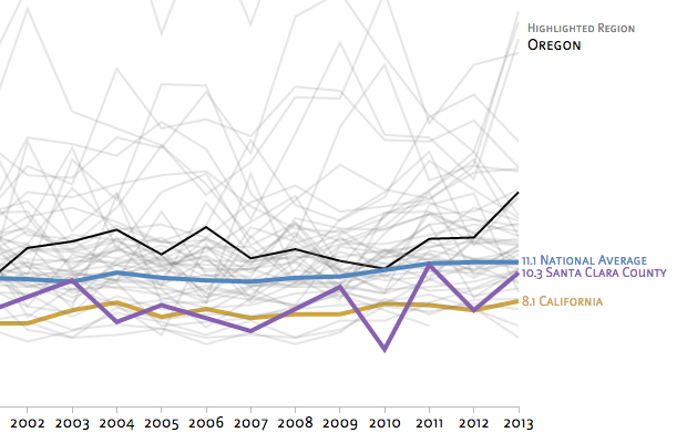
I was initially relieved to see that our state and county were below the national average. Suicide data is not reported on the city level, so I tried extrapolating from what was available anecdotally for Palo Alto (a collection of publicly known cases). I was relieved again, until I realized I was extrapolating against the population of the whole city instead of the age-specific population that relates to the data. A more accurate estimate suggests that we are definitely on the high side.
With the small sample size of a single city (or even some of the smaller states), the data gets jittery. Pretty soon you are looking at individual lives - probably helpful if you really want to understand causation, though less helpful for seeing trends. I may need to take a look at three year moving averages to smooth out some of the jitter and see if that clarifies any trends.
My son saw me working on this and encouraged me to pull in the comparisons to national and county data for a clearer picture. When he saw the graph, he said "You have to share this!" - the power of accurate data displayed clearly.
Part of the challenge for the community discussion here is that one suicide is too many, so talking about comparative data can feel cold and dehumanizing. What wouldn't we do to save even one life? The potential problem comes when you change whole systems based on a handful of tragic cases, and then later realize that you damaged the system and didn't solve the problem you thought you were solving. I hear echoes of this challenge in what I have been reading in Daniel Kahneman's book Thinking Fast and Slow regarding loss aversion and the way humans respond to risk.
As with many things, it’s complicated.
This has been a valuable, if painful, discussion in our community, causing us to examine what we really value and how that gets reflected in our education system. I hope some clear data can contribute positively to the conversation.
