Blog

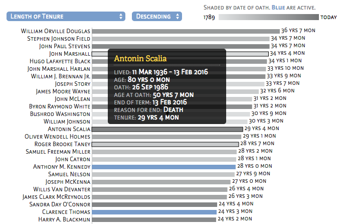
With the death of Antonin Scalia this past week, the U.S. Supreme Court lost its longest currently serving justice. Just a few weeks shy of his 80th birthday, Scalia served for 29 years and 4 months. I looked that up using the interactive infographic I created last year, showing the age and tenure of each of the current justices. A look at all SCOTUS Justices As the country debates when and how a new justice will be appointed to replace Scalia, I wanted to be able to answer a few additional… [read more →]

These core principles have guided my approach to designing communications for many years. I’ve committed them to writing here, with the hope that others might find them useful. Let me know if they are. Design Chi download e-book In traditional Chinese culture, ch'i (or qi) is an internal vital energy — the life force that animates all living things. Compelling visual communication is alive: it grabs attention, engages the reader, and delivers a message that matters. And sticks. In my y… [read more →]

The first edition of our Information Design newsletter went out today. Early response is very positive. Featured in the newsletter are an illustration we submitted to Nature magazine, a sneak peak at our new e-book about designing compelling visual communications, and a short survey. You can access the online version, or subscribe now to receive the next version. The newsletter will be published twice a month. [read more →]

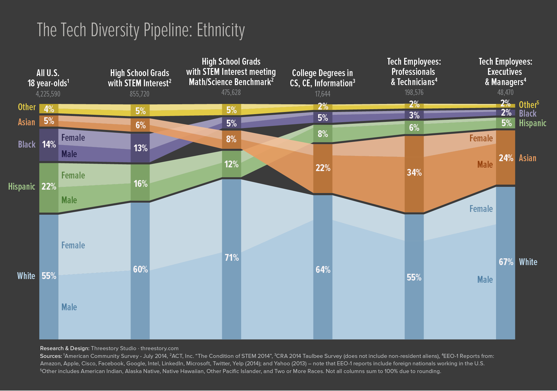
A blog post I wrote about diversity in the Google workforce led to an invitation from Wired Magazine to expand on the idea for a special issue on Race, Gender, and Equality in the Digital Age. I gathered data regarding both ethnicity and gender in the tech workforce pipeline. I also broadened the scope of tech companies included in the data, and took a look at the transition within companies from professional/technician to leadership roles. The article was published in November as part of their… [read more →]

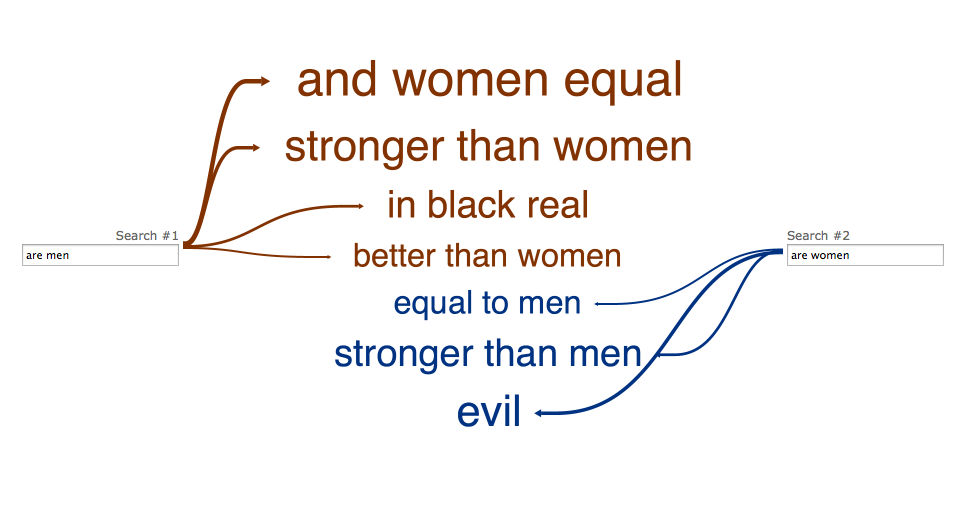
I stumbled across the semi-addicting Web Seer tool from hint.fm this morning. It allows you to compare different Google Suggest results head to head, making for some fascinating juxtapositions. Google Suggest on its own can offer some interesting insights into what people around the world are wondering - going head to head provides some stark compare-and-contrast moments. The creators suggest trying "are men" vs. "are women", for example. The result: Checking different… [read more →]
See even older posts on our previous blog
