Blog
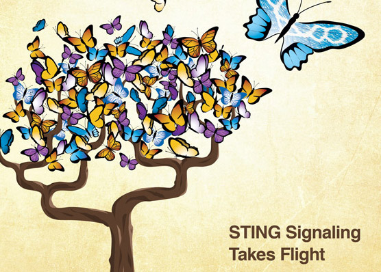
Threestory Studio created the cover illustration for the edition of Molecular Cell that was published online today. It's the latest in a series of scientific journal covers we have designed. The research is the work of the Doudna Lab at U.C. Berkeley. Why butterflies? Apparently, there is a receptor protein (called STING) with potential for cancer treatment that sends signals by changing shape much like a butterfly moving its wings. You can see the rough outline of the molecule in the wings of… [read more →]
An online conversation this week about a Time Magazine infographic caught my attention. It started on Stephen Few's blog and continued on Alberto Cairo's. They both make excellent points. Many will defend the use of otherwise extraneous illustrative elements in a data graphic as a means of catching attention and aiding retention. I agree that those are two admirable goals and need consideration, provided that the primary goal is still to facilitate insight. The discussion, including the… [read more →]
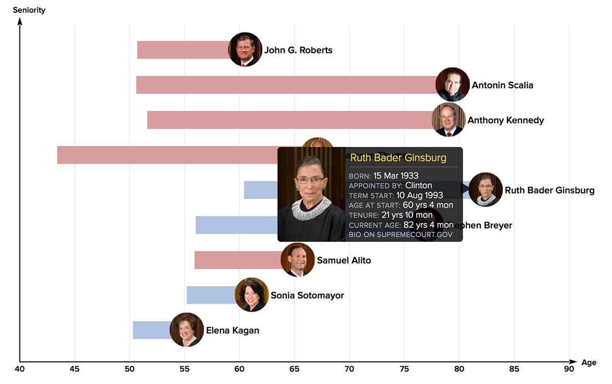
With the recent and newsworthy end of the U.S. Supreme Court term, I heard a radio report discussing the likely timing of Ruth Bader Ginsburg’s retirement. It made me want to know the age and length of service of each of the justices. My first reaction, of course, was to graph it. The data was readily available, as were public domain photos of each justice. The graph shows a bar starting at the age at which each justice began his or her term, and ending at their current age. You can… [read more →]
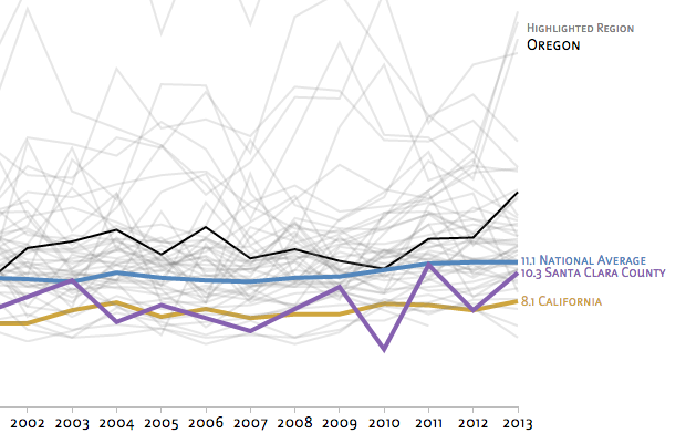
I recently completed an online class, Data Visualization and Infographics with D3, taught by two great teachers: Alberto Cairo and Scott Murray. I have worked on a few D3 projects from the design side before, but this was my first real foray into doing the code myself. For class exercises, I picked a dataset to work with that I cared about: youth suicides. You can see the interactive graphs I created here. Clusters of suicides among young people in our community have, understandably, caused… [read more →]
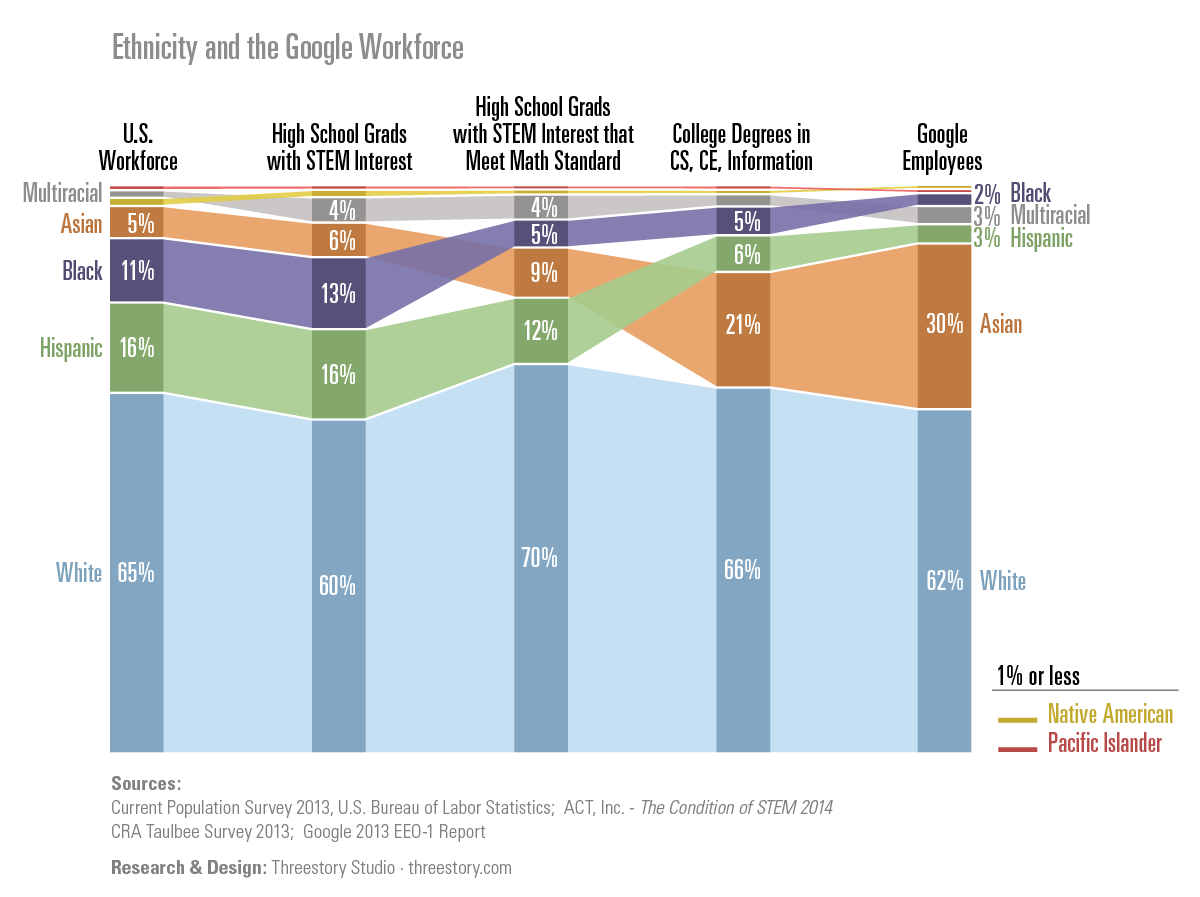
I was reading an article in Fast Company this week called The Visible Man by J.J. McCorvey about being black in Silicon Valley. A statement on the first page caught my attention: “...of [Google’s] 46,000 employees, just 2%—and just 1% of its technology workforce—are black.” Followed by: “In case you were wondering, blacks make up 13% of the U.S. population.” Comparing 1 or 2% of the Google workforce to 13% of the U.S. population felt dramatic, but incomplete. I det… [read more →]
See even older posts on our previous blog